Mobile · React Design System · Compliance-critical · Research
Mobilizing Privileging
Privileging — the workflow defining what a provider is legally allowed to do — was cut from mobile V1 as too complex. I made the case to bring it back, translated a dual-monitor legacy form into a mobile-first hierarchy, and turned the validated patterns into foundational components of the new React design system.
TL;DR — impact
- Designed the mobile privileging experience — cut from V1 as “too complex” — for the 15,000+ providers (of 44K users) who depend on this workflow
- A/B-tested two mental models with real providers; the losing assumption reshaped the information architecture
- Status: design complete and research-validated; not yet in production. I argued for a strategic pause rather than shipping on the legacy Angular stack mid-replatform
- The shipped outcome so far: the validated Card component, now adopted across HealthStream’s product suite through the new React design system
Context
HealthStream serves 44,000 active users across 200+ healthcare organizations. About a quarter of them — more than 15,000 providers — log in specifically to request privileges: the legal and clinical definition of what they can do at a given facility.
When the application was first mobilized, privileging was left behind. It was too dense, too tangled, too risky to ship in V1. Providers were told to switch to desktop for the most important step of their workflow. I argued that wasn’t really a mobile product — it was a mobile preview with a redirect — and made the case to bring privileging into V2. I owned the design end to end.
The opportunity
The desktop form is so data-dense it’s typically used on dual monitors. Many of its fields are paper-form artifacts that have outlived the workflows they were designed for. I framed the project deliberately: not port the form to mobile, but translate high-density legacy data into a mobile-first hierarchy.
Core insight
Before redesigning anything, I needed to understand what the form was actually doing for the user — not what it was historically doing on paper. With our researcher, I ran a first round of interviews that walked providers through every feature on the existing form, asking how often they used it and what they’d miss without it.
The finding became my design constraint: at its core, a privilege form is a list of privileges and descriptions, organized by hierarchy. The most important content — by a wide margin — is the privilege description itself. Providers don’t skim it. They read it. The majority of screen real estate had to belong to that description; everything else was supporting cast.
Component decision: cards over lists
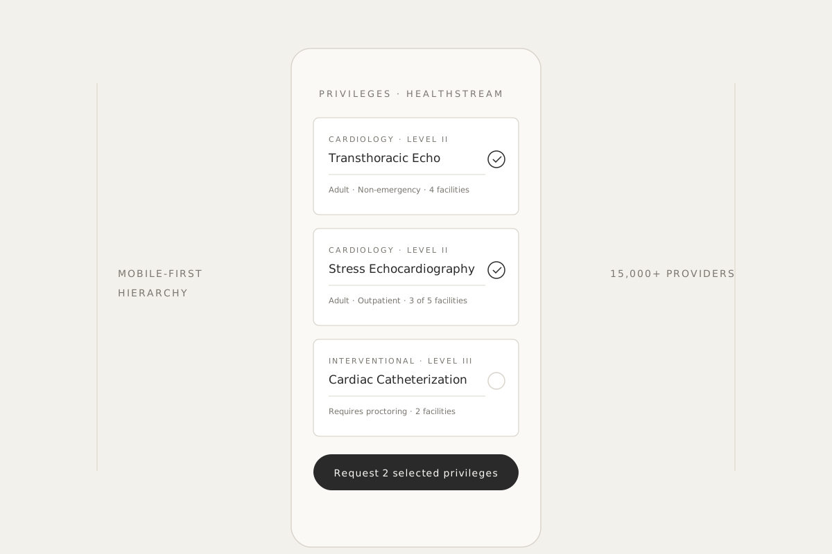
With dense text, the realistic options were list, table, or card. Lists and tables are more compact — and on a desktop with dual monitors, that’s an easy call. But privileges aren’t display-only. Each one is interactive. Lists and tables don’t carry that affordance the way cards do.
I chose cards. The tradeoff was vertical length; the gain was that wrong selections aren’t usability failures, they’re credentialing violations. The design had to slow providers down on the right things, not speed them past them.
Round-one testing confirmed it sharply: with cards, providers immediately understood the rows were interactive. With lists, several participants tried to read past them as if they were static content.
Two mental models, one A/B test
Every privileging decision has two variables: what is the privilege, and where do you want to practice it. So I designed two directions in parallel — facility-first (“look at this facility, decide which privileges to request here”) and privilege-first (“look at this privilege, decide which facilities you’ll practice it at”) — and ran an A/B test to see which mental model providers actually held.
For each direction, I designed for the realities I’d surfaced in research: providers typically apply to ~5 facilities, with mostly the same privileges across them. Bulk selection was non-negotiable in either layout.
The mental model finding
I expected the long privilege-first form to be the problem. It wasn’t. Providers praised it — clear, scannable, efficient with bulk actions.
The surprise was on the facility-first side. Providers were repeatedly confused by the facility multi-select. They didn’t read it as “filter the form to these facilities.” They read it as “I am requesting privileges at these facilities.” Tapping a facility, in their mental model, was already submitting a request.
On desktop, providers can see the whole picture — form, facilities, request flow, submit button — and they have the context to know they’re in setup mode, not commit mode. On mobile, that context disappears. The first interaction they encounter defines the mode for the whole session. On mobile, the existing mental model wins every time.
Privilege-first wasn’t just easier. It matched how providers actually think about privileging.
Designed for risk
Privileging is high-stakes. I deliberately built three layers of error protection into the form:
- Default to the safe path — for re-credentialing providers, previously granted privileges are pre-selected and visually flagged. They review rather than reconstruct.
- Surface inconsistencies at a glance — each card shows when a privilege isn’t requested at all available facilities, so providers can spot uneven selections without drilling in.
- The text is the gate — the privilege description stays front and center on every card. Providers cannot accidentally request a privilege without engaging with what it actually means.
These aren’t usability decisions. They’re risk-mitigation architecture for a clinical workflow.
The strategic pause
As high-fidelity prototypes were finalizing, our organization announced a major architectural shift: Angular to React.
I could have shipped on the legacy stack and called it a win. Instead, I argued for a strategic pause. If we shipped on Angular, every line of validated code would be rebuilt from scratch within 12–18 months, with no guarantee the rebuild would carry the same care or the same research backing. The right move was to transition the validated patterns into the foundation of the new React design system instead.
From component to system
I owned the Card component spec for the new design system. The argument I made — and the design system team agreed with — was that we should build the Card around the most complex data-entry use case first. If it could handle privileging, with 30+ rows of dense legal-clinical text and multi-variable selection, it could handle anything any other product team would throw at it.
That bet paid off. The Card is now the standard high-density interaction component across the HealthStream suite — Learning Platform, Conflict of Interest, and every other product team adopting the new system.
While I was at it, I revisited every element on the desktop form and stripped the paper-form artifacts that had outlived their use. The mobile form isn’t a shrunken version of the old one — it’s a deliberately scoped form that reflects what providers actually need today. And I designed the Card with structural slots for two features I knew were coming next: qualification requirements and volume thresholds.
Where this goes next: augmentation, not automation
The project itself doesn’t ship AI. But the structured information architecture is exactly the foundation our AI work needs. Two patterns we’re now exploring:
Qualification warnings. When a provider requests a privilege from a cluster they don’t qualify for, the system surfaces a warning at decision time, in context, on the card — with the why attached (“this cluster requires Board X, your record shows Board Y”). The provider can override, correct, or escalate. We never auto-block.
Low-volume alerts. Volume thresholds today live only in retrospective performance reports — useful for review, useless for prevention. Pulling that data forward into the request moment turns retrospective reporting into prospective decision support.
In a clinical workflow, automation is the wrong default. Auto-removing privileges, auto-rejecting requests, or auto-summarizing dense privilege descriptions all carry real risk. A single wrong summary could mislead a provider into requesting or skipping the wrong scope. Our posture is consistent: provider as decider, system as assistant. Every signal surfaces the why. Every action is reversible. Every override is recorded for audit. We use AI to reduce error, not to remove agency.
Outcomes
- Zero participants confused by the privilege-first layout in round-two testing — a clean reversal from the facility-first confusion.
- Card component shipped through the design system and adopted across HealthStream’s product suite — Learning Platform, Conflict of Interest, and every team on the new React stack.
- Paper-form artifacts stripped during the modernization pass, reducing the form’s footprint without losing essential function.
- Future-proofed slots for qualifications and volume — features land without redesign cost.
The full privileging form has not yet shipped to production, so I don’t have post-launch usage data yet. The Card adoption across the organization is the measurable outcome the project has already produced.
Reflection
My biggest takeaway was about my own assumptions. I assumed facility-first would feel cleaner because it grouped the data tightly. The mental model finding showed me providers don’t think about privileging as a filtering problem — they think about it as a requesting problem, and on mobile every interaction reads as committal because there’s no surrounding context to soften it.
If I were starting today, I’d run a mental-model exercise before drafting either layout — ask providers to describe the form they expect, before showing them anything I designed. Building both directions in parallel was the right move given what I knew, but I’d rather catch the mental-model issue in week one than week six.
The original ask was: mobilize a form. The actual outcome was: define how an entire product organization handles complex data interactivity, and lay the structural groundwork for AI-assisted clinical decision support.